Project Description


Shallop
Brand Positioning and Identity Redesign
Client: Shallop
The professional brand specializes in improving the oral health of the general public.
Established in 1991, Shallop has been dedicated to Taiwan’s oral hygiene market. People have a certain degree of brand memory. However, facing the problems of brand aging, obscure brand cognition and more, it is expected that with brand rectification, it is able to make the brand image younger and fresher. It also allows consumers to understand Shallop to be professional and dedicated in brand management.

Retain the memory, and shows the clean and modern design.
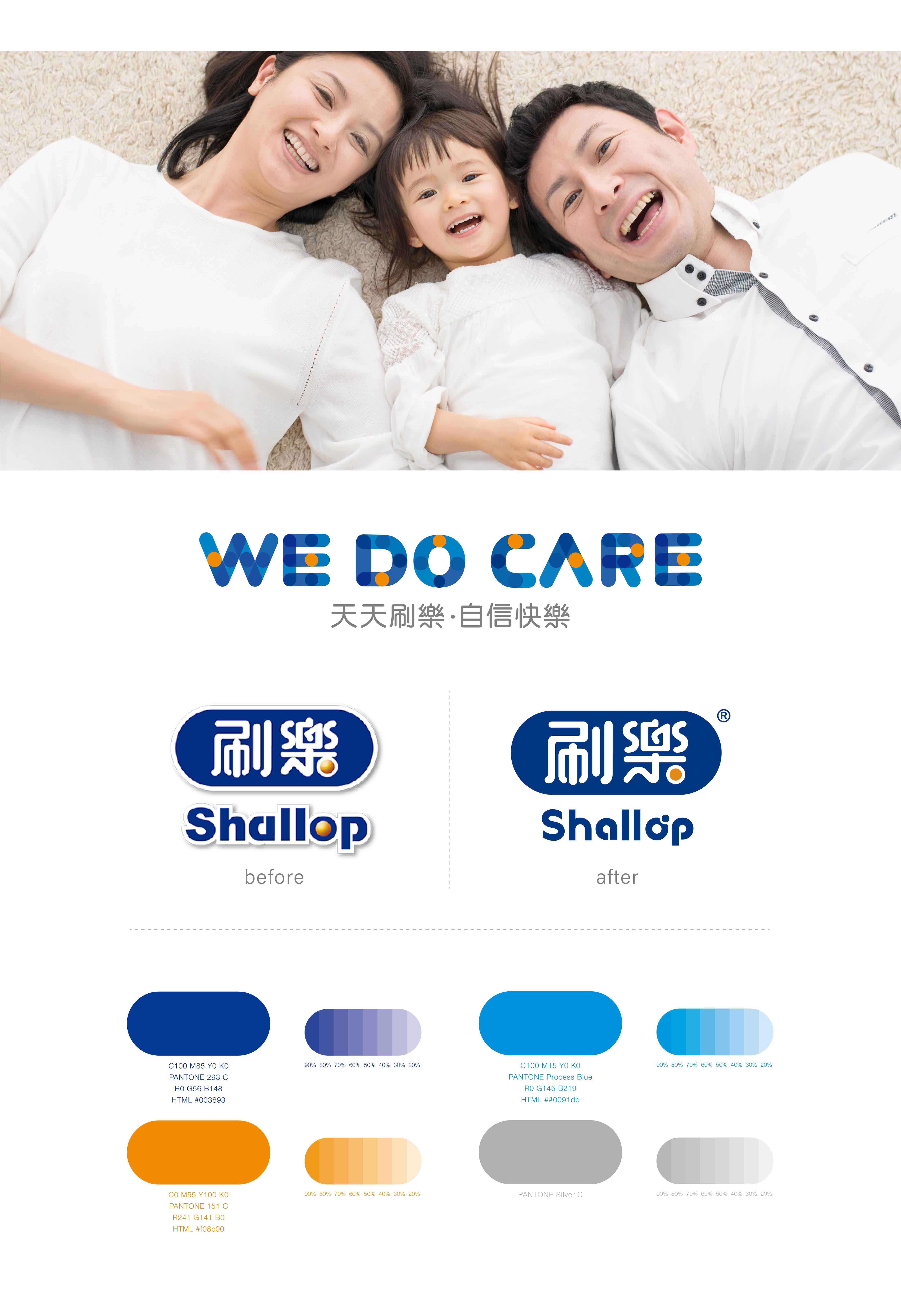
“Shallop” has accumulated certain brand awareness in the market. In the brand reconstruction project, the major mission is to keep the original tone and memory, allowing the modification of the mark to communicate the sense of being more modern and practical. Therefore, we fine-tuned the original fonts, allowing the distance among the Chinese fonts to be more even and congruent and the lines and dots of the English fonts recall the target tone of the Chinese fonts. About the usage of colors, it employs hi-tech blue to symbolize professional quality; orange to symbolize care and concern, expressing the spirit and idea of health and harmony. It allows the overall identification to communicate the aspects of professionalism and innovation in time, the feelings and friendliness of being close to people, demonstrating the new look of the brand.

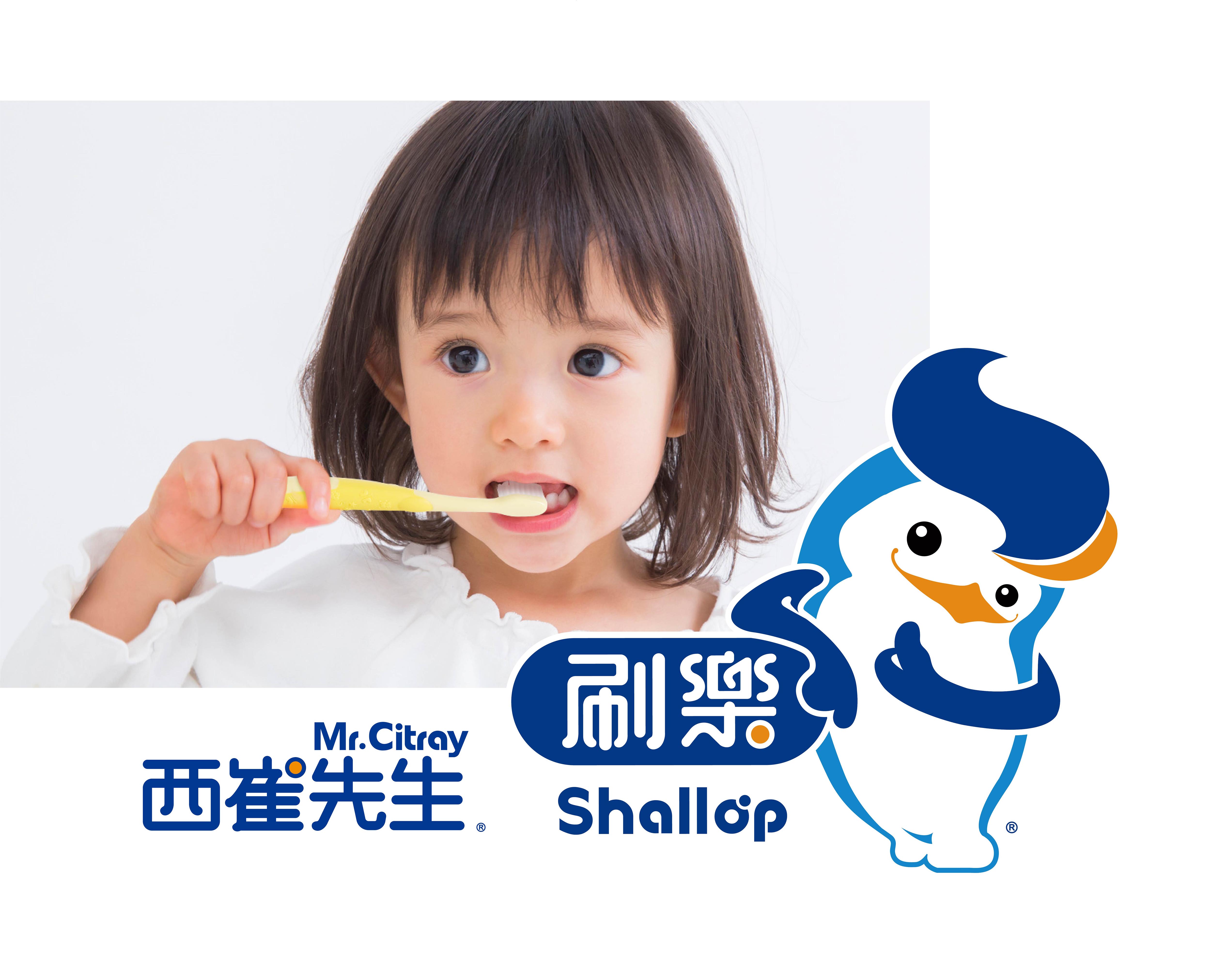
Approach: Brand Strategy / Brand Positioning / Identity Design / Brand Identity System
