Project Description


Fuhang Soy Milk
Brand Image Refresh Planning and Design
Client: Fuhang
The professional brand specializes in improving the oral health of the general public.
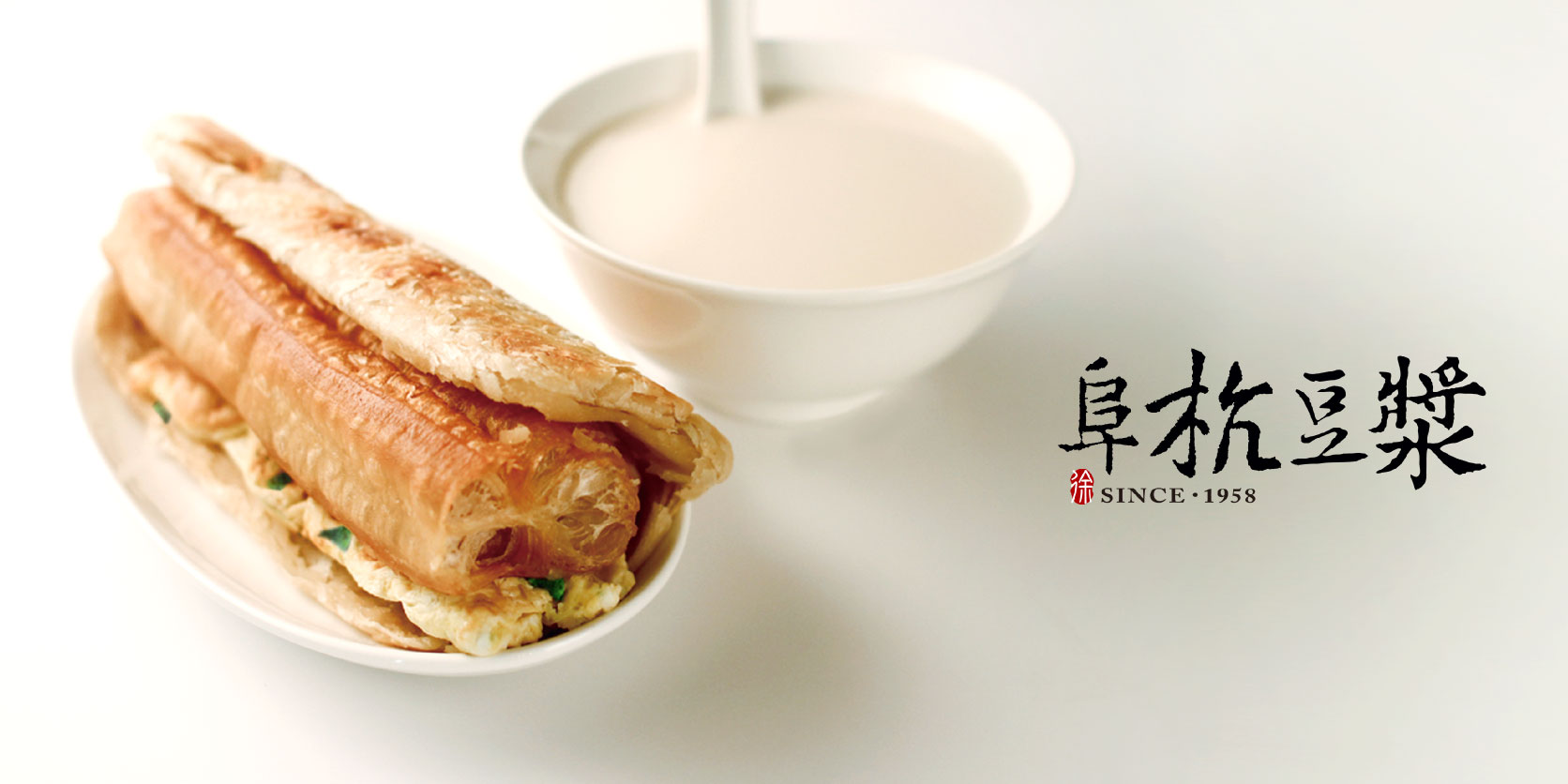
With over fifty years of history, Fuhang Soy Milk is a time-honored breakfast institution in Taipei. Over the years, Fuhang has always remained true to its values—serving only hand-crafted, made-to-order breakfast delicacies. Fuhang sees itself beyond a breakfast destination, and seeks to become an innovative culinary brand…


Retain the memory, and shows the clean and modern design.
Generations-old, Hand-Crafted Delicacies Made with Commitment
Passed down through the generations, the Hsu family’s company promise—“sincerity, good taste, and hand-crafted”— is highlighted in the design. The simplistic design reflects the brand’s sincere, down-to-earth spirit: when tradition meets modernity, the design preserves the uncompromising, professional dedication found in time-honored brands, and adds a dash of contemporary design aesthetics.

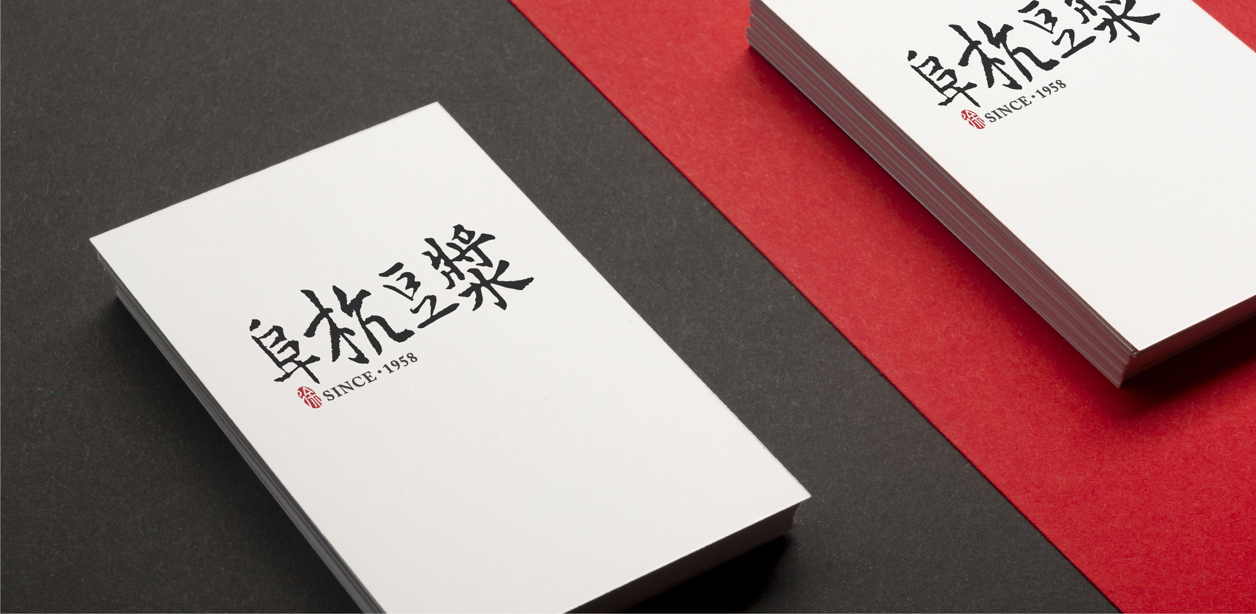
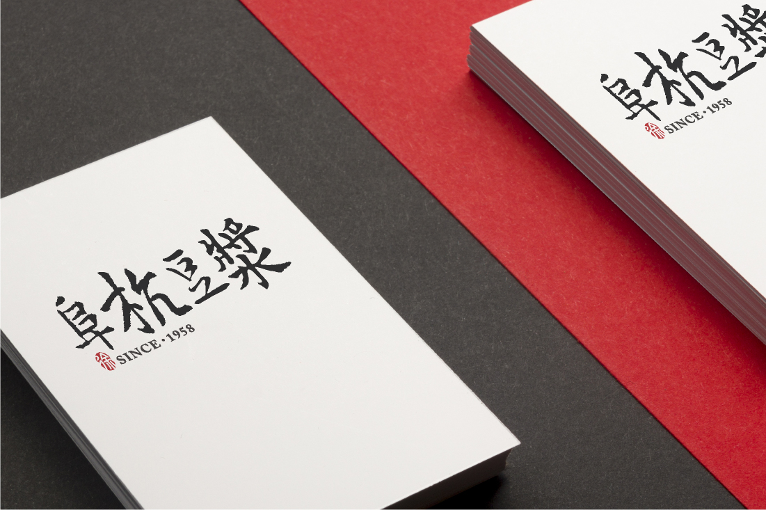
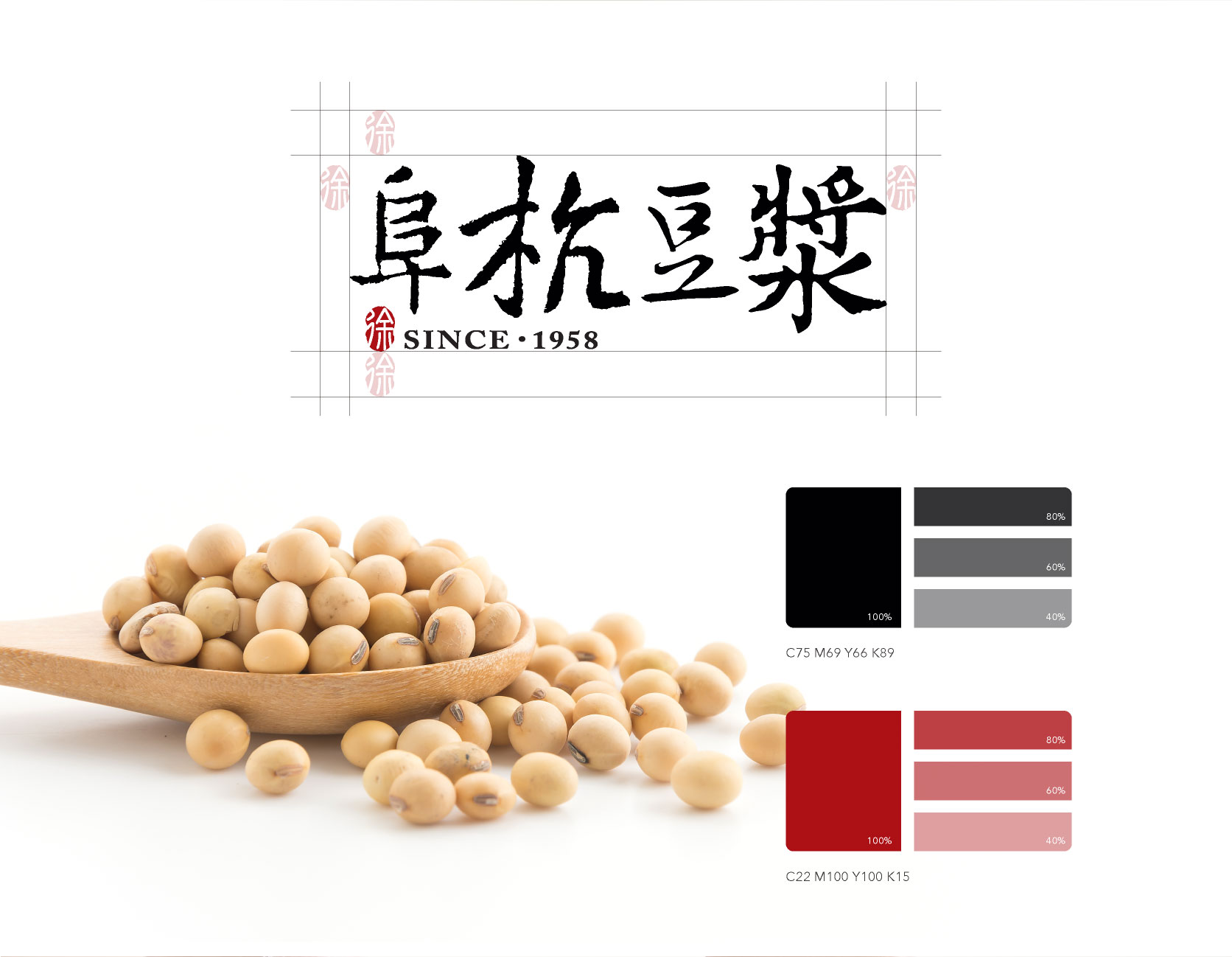
The logo design highlights Fuhang Soy Milk’s old-time, customer-trusted character—the calligraphy typography and imprint image accentuates the brand’s long history and feel: the black traditional-style typography overlays the pure white background, as if floating out of white soy milk. The date of establishment, and “Hsu” character red stamping bring out the brand’s classic memories. With a down-to-earth spirit, Fuhang continues to provide customers with traditional, unforgettable flavors. The business card utilizes white and red colors to create an old-meets-new image, which characterizes an old-time brand’s persistence on its profession, and incorporates a modern aesthetic style.
Approach: Brand Design
