Project Description


divinia
divinia Cleansing Package Design
Client: watsons
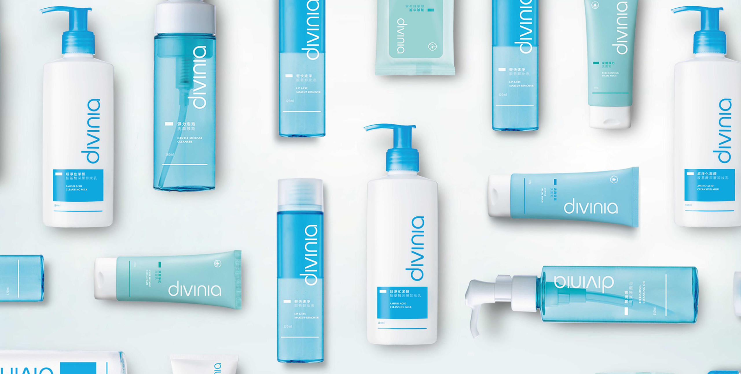
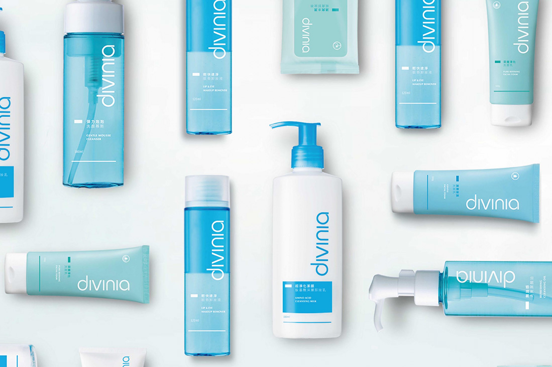
Complete Cleaning Series, Enhanced Texture by Fresh Design
divinia targets users who are “Young, modest, and wholesome” through a series of facial care products. Its packaging uses a standardized color scheme in combination with azure colors to create a feeling of nature fresh.

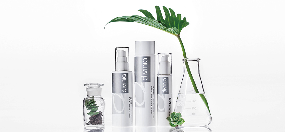
Skin Whitening Series, Easy One-step Lightening
The Watsons’ divinia whitening series packaging uses the appeal of “fully whitening with ease.”On the packaging, there are silver color pieces with large areas of white, combined with the “α” words highlighting the features of Alpha-Arbutin, which directly indicate the strong whitening functions with a better sense of professionalism and trust.

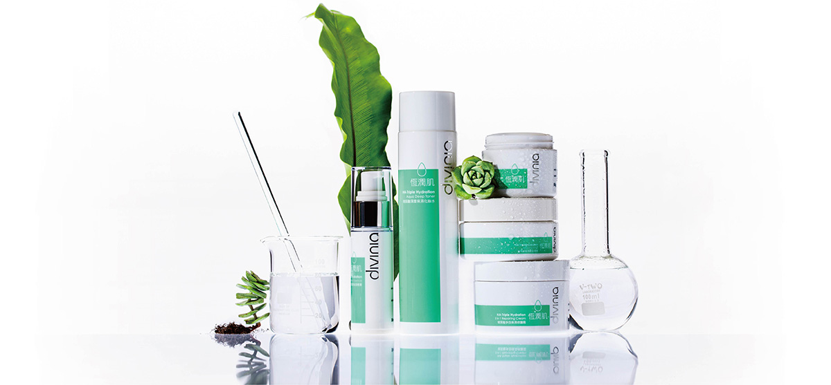
Skin Moisturizing Series, Bringing you Light, Charming Skin
The HA-Triple Hydration series is a series of moisturizing products designed exclusively for Asian women under the divinia brand. Its appeal is to keep the skin hydrated and moisturized. In terms of overall design direction, we presented key visuals with color blocks in order to maintain consistency with the refreshingly clean and concise vibes found throughout the divinia brand, as well as to differentiate the products from the competition. An invigorating feel was created for this series thanks to the logical layout of the text as well as the refreshingly clean and matching colors.
Approach: Package Strategy / Package Design / Printing Planning
